Analyzing LMPs with a Nodal Price Map
Visually navigating the landscape of locational marginal pricing of electricity in the United States
At Grid Status, we're always seeking new ways to improve access to information related to the electricity system. So, when we realized there was no publicly available national map of electricity prices, we decided to build it.
Our goal was straightforward: to create one place that consolidated real-time and historical wholesale electricity prices across the country. To be successful, we wanted to design a map that highlights what matters in the moment and makes it easy to dive into the details.
After months of beta testing, we’re pleased to officially write about using our national Nodal Price Map to analyze LMPs.
In this post, we will
- Explain the data behind this map
- Walk through the meaning of each component of LMP
- Demonstrate how to use the map to analyze transmission congestion around data center alley in PJM.
What is a Locational Marginal Price (LMP)?
At any moment, there are many different ways (or “solutions”) to operate the same electricity system. One purpose of electricity markets is to find the “least-cost” solution to balance anticipated load and available generation, considering physical and financial constraints and market rules like offer caps.
To promote efficient dispatch of power plants based on this “least-cost” market solution, power markets use Locational Marginal Prices to reflect the value of electric energy at different locations on the system.
Each system operator in the US (whether ISO or RTO) runs at least 2 market processes that produce LMPs to “solve” their respective systems: Day-ahead (DA) and Real-time (RT). This core process dates back to the discussions around Standard Market Design (DAM/RT two-settlement system) in the late 90s and early 2000s.
Building our Nodal Price Map
Since founding Grid Status, we have normalized the different reporting schemes of the ISO/RTOs to provide LMP data for more than 60,000 pricing points. With national coverage of LMP data we were well-positioned to build a map.
To visualize LMP data on the map, we had to determine the geographic location of each pricing point name. Unfortunately, this geographic mapping isn't universally available. Through various methods, including hand-labeling, we annotated nearly 20,000 pricing points to specific coordinates. These points cover every type of priced point on the grid, from generator settlement locations to electrical buses, trading hubs, and market interfaces.
Exploring Data on the Map
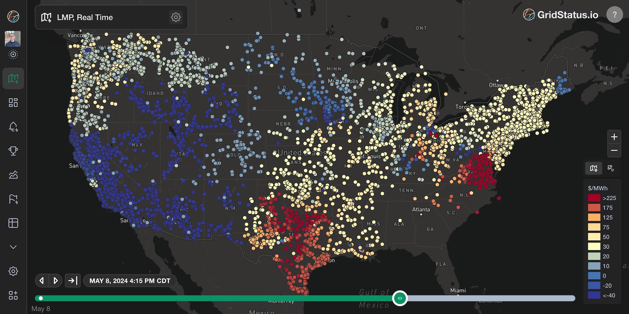
The map enables historical data exploration as well as a real-time view of the markets. Not only can you see price activity in real-time, but you can use it to review past events through a geospatial lens.
Configuring the Map
The map facilitates visualizing trends in LMPs (as well as the components of an LMP) in both day-ahead and real-time markets as well as through the DART spread.
On the upper left of the page is the collapsible Map Settings control panel, the options here control the current map display.
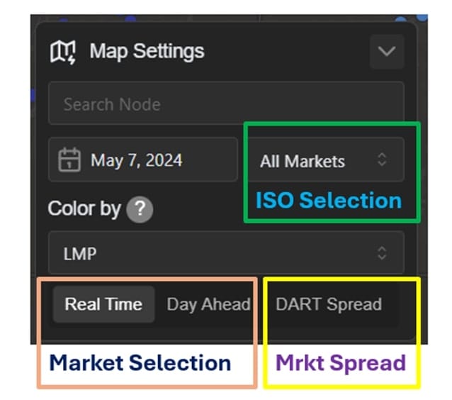
The bottom row of the settings panel allows for quickly swapping between day-ahead, real-time, and the DART Spread. DART is the subtraction of real-time prices from day-ahead for a particular node and moment in time. A larger spread is generally indicative of changing conditions during real-time or poor forecasts in the day-ahead.
More on DART Spreads
The DA market is an estimated solution for future operations during the following day. It relies on a set of assumptions based on data that is at least 12 hours old by the onset of the relevant RT Market. DA inputs are a mix of centralized forecast values, inputs from constituent members, bilateral contracts between market participants, and “best guess” financial bets. There are many adjustments between the solution for DA LMPs and the RT market solution because this uncertainty is so great.
With that mélange of inputs, Day Ahead to Real Time differences in the components of an LMP are expected and normal, but can vary widely in their size.
Most markets, with the notable exception of ERCOT, report three LMP components, which together equal the LMP. The map can be configured to color nodes by LMP or each of the components individually.

So, what are these three components of LMP?
LMPs, Greater than the Sum of their Parts
Whether day-ahead or real-time, LMPs have multiple constituent parts. Understanding these components is crucial to translating raw data into actionable insights, so let’s break them down.
Energy
The energy component is the system-wide cost of the marginal MW as derived from the individual characteristics and bids of each active generator in the market. You may see these bids referred to as the merit order or as part of the bid stack as well (we discussed the merit order previously). You can think of this as the base price upon which the other grid management pieces are layered to arrive at an LMP.
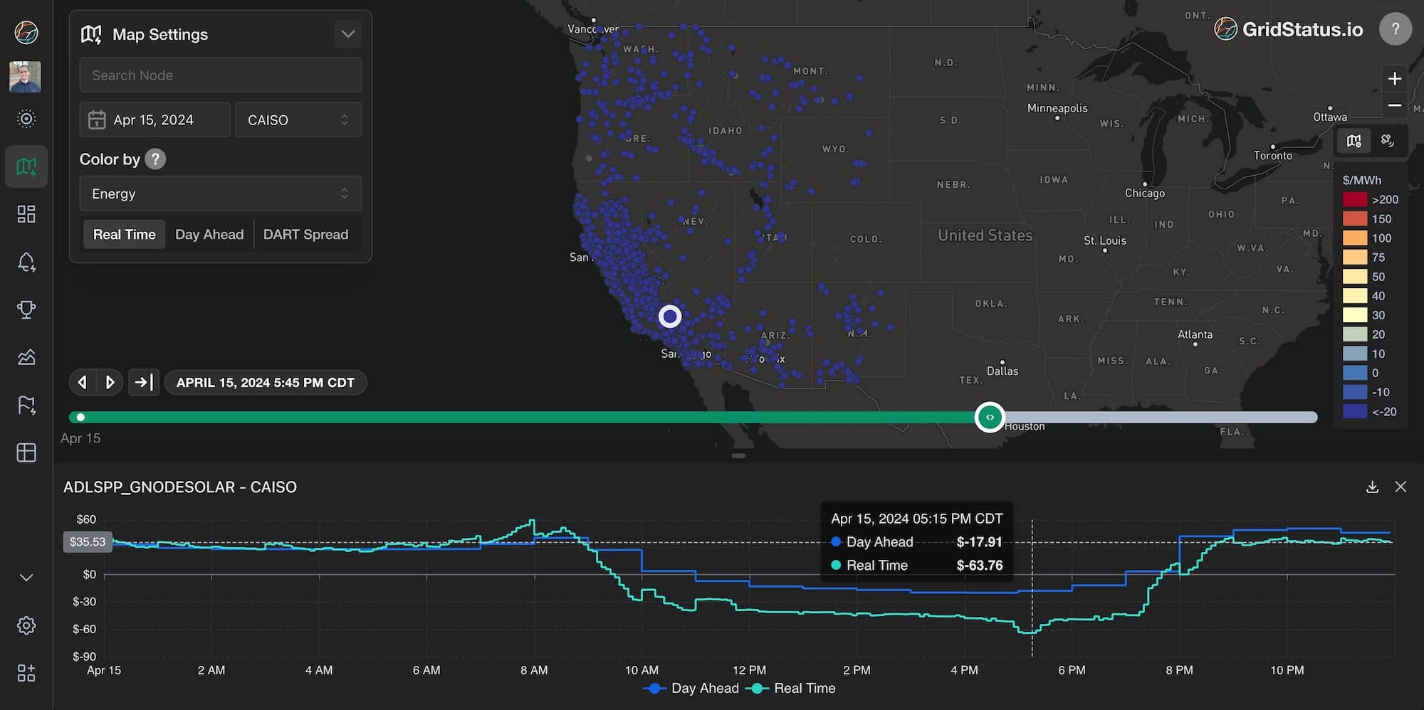
The energy component is normally a positive number, but system wide energy cost can be negative when renewables are plentiful. For example, here is a typical spring day in CAISO
Energy costs can also swing the other direction. Let’s take a look at ERCOT for some extreme energy prices. On May 8th, ERCOT nearly hit their energy price offer cap of $5,000/MWh just after sunset, as net load was peaking.
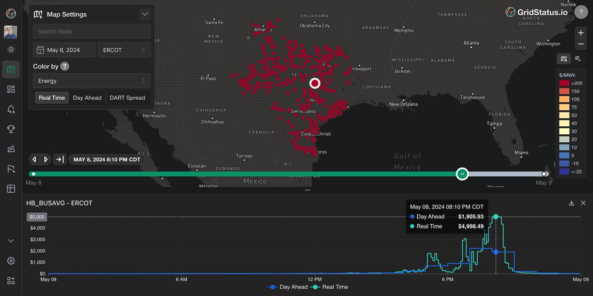
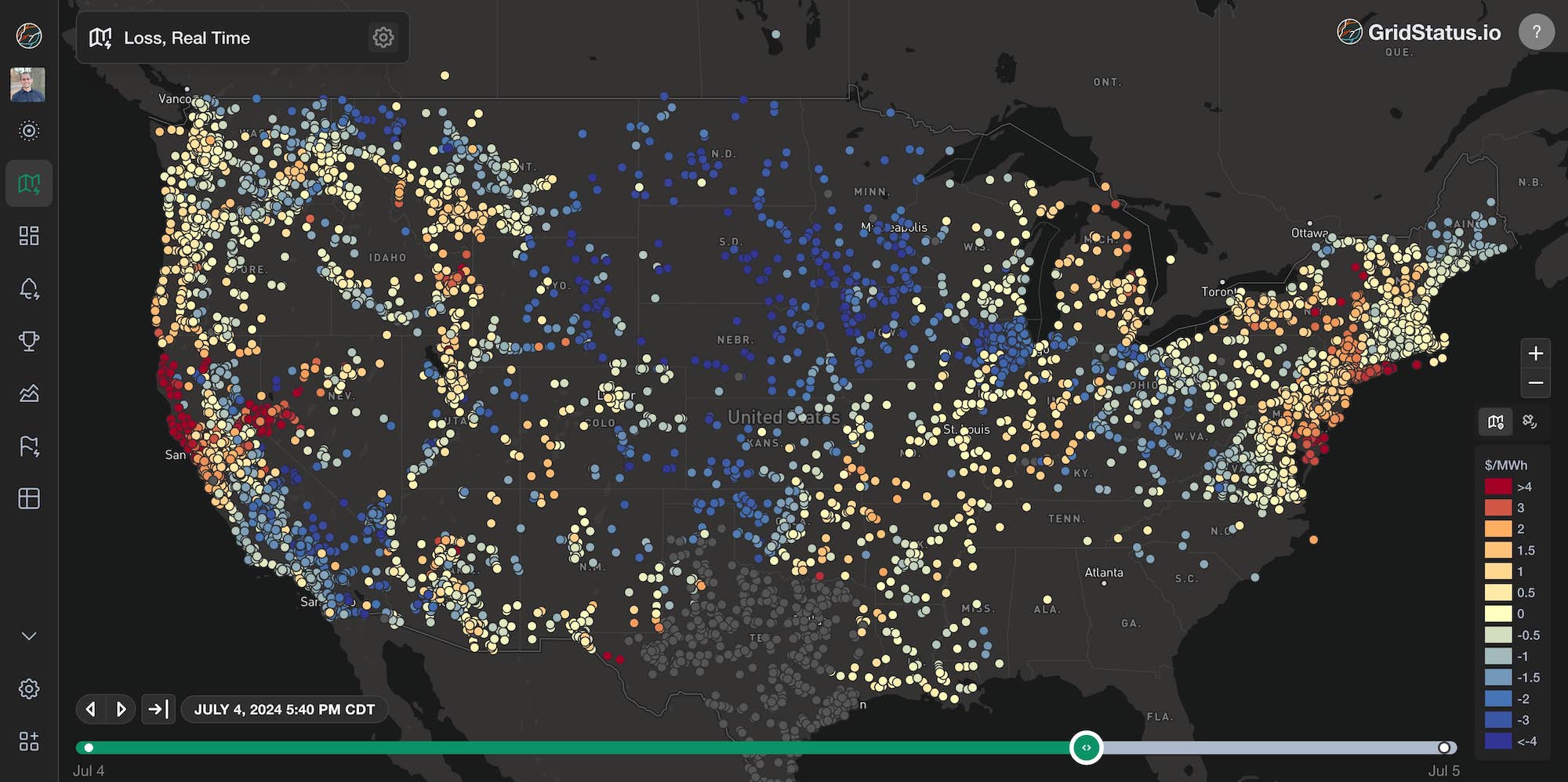
System wide costs, whether high or low, tend to be unremarkable in their uniformity, but a map of uniformly high prices tends to imply that the ISO is facing a general energy shortage.
By visiting our ERCOT dashboard for this time period, core drivers of a macro capacity supply issue become apparent.
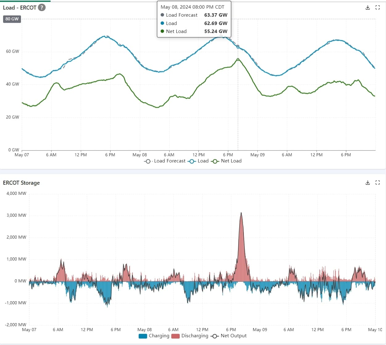
Outages were very high (over 20,000 MW) during a heatwave, which also saw low wind generation. While gross load was similar across all three days, Net load peaked on the 8th due to high demand and low renewables. This led to high levels of energy storage discharge in order to meet the system peak. Storage resources tend to have some of the highest priced energy offers, which is reflected in the energy component of the LMP.
Loss
The loss component of an LMP is a representation of grid physics, it quantifies the power lost in the system as heat due to resistance. This component’s value reflects the discount or premium that adding generation at a given point would have on the physical transmission losses of the entire system.
The loss component can be positive or negative and the value’s sign depends on whether the injection of a megawatt at that point decreases or increases overall system losses. Because the typical range of values is relatively small, the colorbar scale is much narrower when examining this component.
The loss component of an LMP is calculated differently across the country. To assist in understanding this component we prepared a table of how each ISO treats losses, which you can find in the appendix at the bottom of this post.
Notably, ERCOT completely ignores losses in its operations. The implication of ignoring losses has grown in recent years as the physical spread between generation and load in Texas has increased - look for future thoughts from us on this phenomenon and its impact on operations.
Congestion
The congestion component serves to send price signals to generation and load resources to manage the reliability of the transmission system. This value can be positive or negative and ranges from a small fraction of the energy price to many times larger. A negative congestion price drives down the LMP, indicating that generators should turn down or flexible loads should turn up. A positive congestion price implies a need for additional generation or a reduction in load.
While a single line's impact may be observed throughout the system depending on the severity of the congestion, often you can pinpoint the nodal “ends” of a congested line by determining the highest and lowest congestion values for a given constraint. Congestion trends can be persistent but the creation of constraint-contingency pairs are ultimately informed by ISO/RTO application of NERC reliability criteria and over time, transmission system improvements tend to relieve congestion.
All deregulated markets in the US utilize congestion pricing. While ERCOT does not provide this value as a separate component of the LMP, it can be derived for each individual node relative to the Hub average.
In order to further explain this component of LMP, let’s take a deeper dive into an example of persistent congestion currently occurring in PJM.
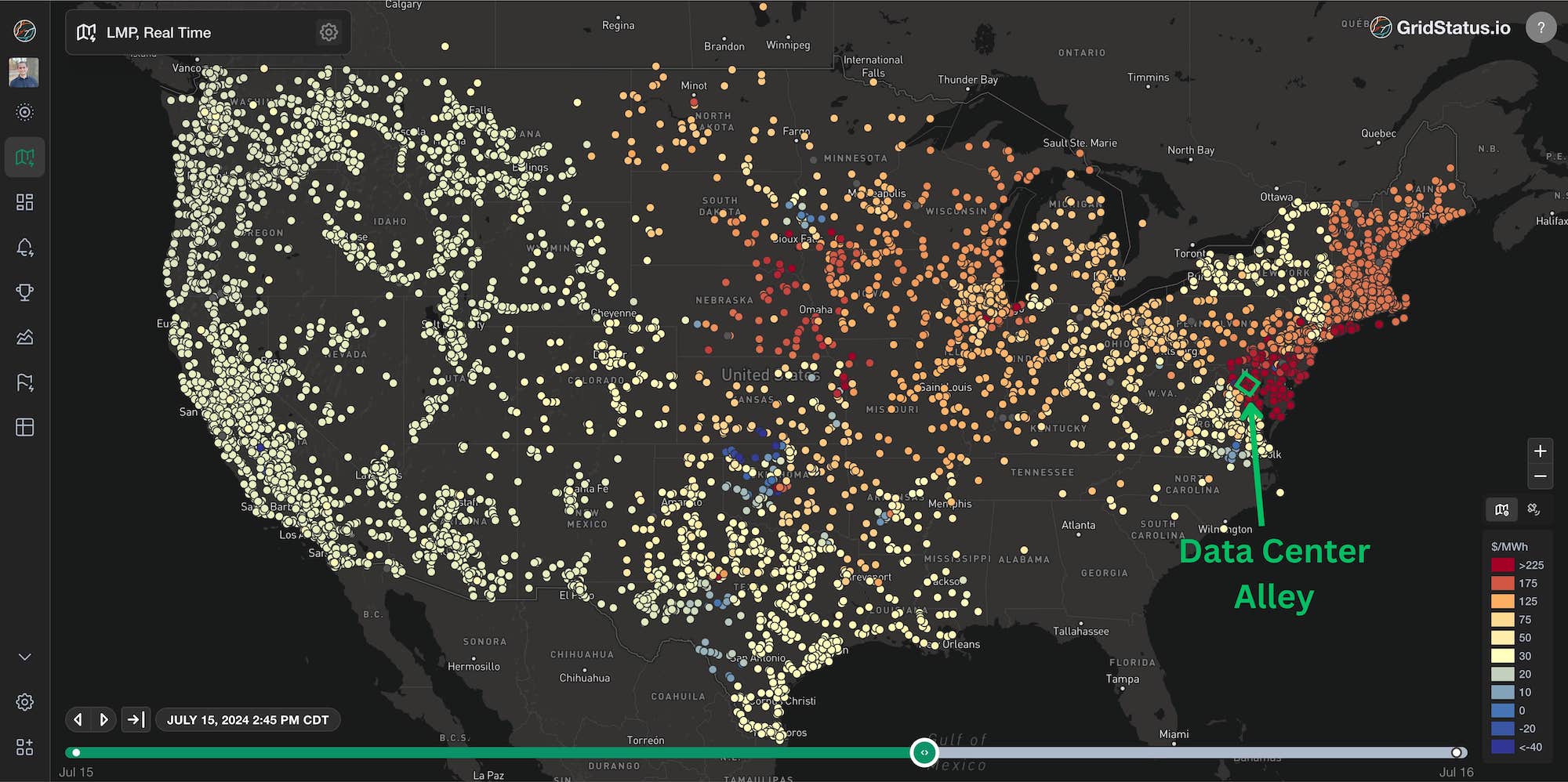
Congestion Impact of Data Center Load Growth
Congestion occurs for many reasons. One of the more interesting examples of persistent congestion recently has been around data center load growth pockets.
Globally, there is no more concentrated hotspot of compute than northern Virginia’s “data center alley”, served by Dominion, which is a member of PJM.
In some ways, data center alley is a peculiar example of congestion because the issue is well understood by the local utility, and was known at least 3 years in advance of becoming an issue. However, due to the difficulty in building transmission right now the required upgrades can’t be completed in time to meet anticipated demand.
Dominion’s 2024 load growth projection shows rapid growth that even outpaces 2023’s blockbuster numbers.
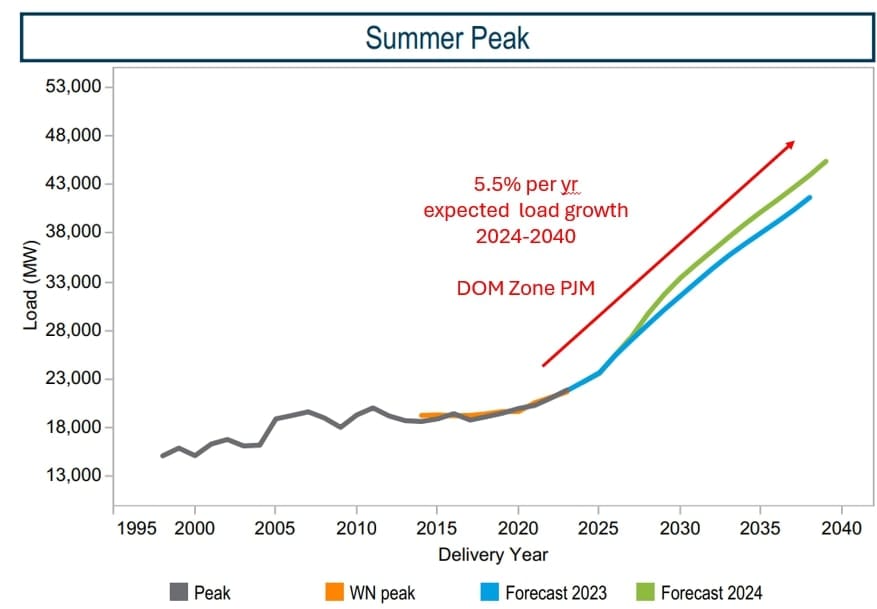
Approximately ~4,000 MW growth has already occurred in data center alley over the last 5 years with plenty more on the way. Each green dot in the below map is an existing data center.
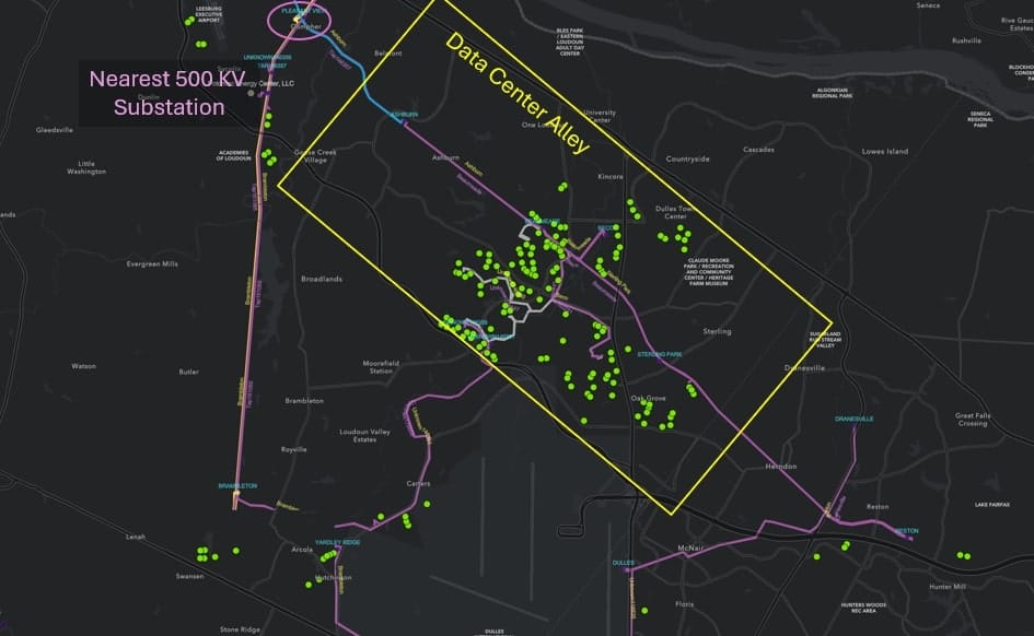
The result of this load growth and delayed transmission upgrades is large congestion differentials that manifest at physical pricing points ‘next to’ each other geographically
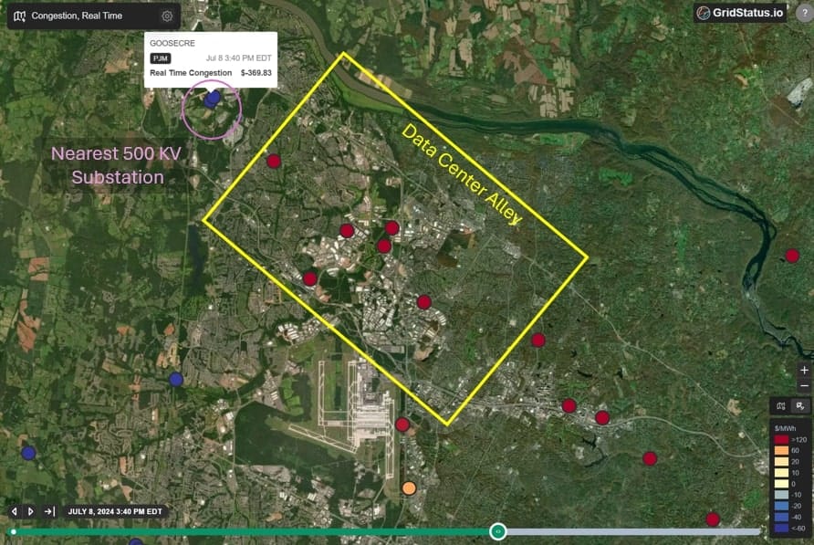
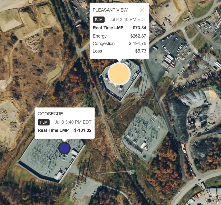
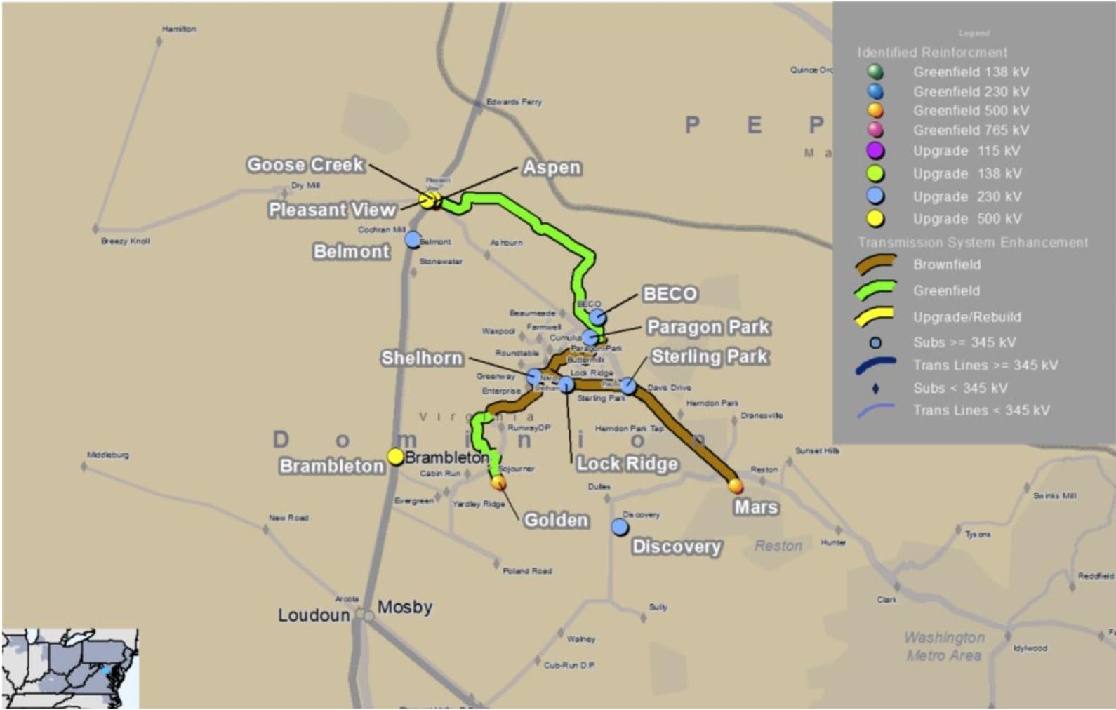
The two substations shown below, Goose Creek and Pleasant View, experience vastly different pricing due to the calculated impact of additional MWs at each location.
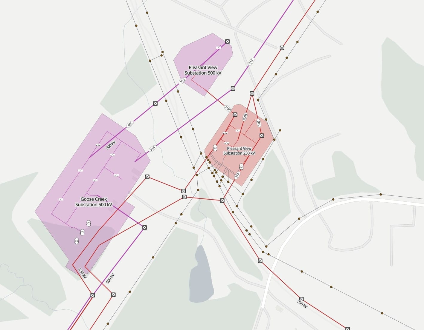
At a high level, these large spreads are because Goose Creek has direct access to the lower voltage network while flows through Pleasant View require the additional “travel” through a step-down transformer in order to serve load.
Using shift factors and shadow prices to determine congestion
We measure the impact of the constraint (as defined by the constrained element and direction of power flow) by constructing a shadow price. The shadow price is determined by solving the electricity market (either DA or RT) with the transmission constraint “relaxed” by 1 MW (through load reduction or generation reconfiguration). The dollar amount saved is the marginal cost of the constraint, or the shadow price. It is not always positive. Shadow prices have limits set by ISO tariffs.
A shift factor is a value between -1 and 1
- The absolute value of the shift factor answers this question: “if I inject 1 MW at this node, how much of that MW will reach the constraint?”
- A shift factor of 1 implies that the entire MW will reach the constraint, and a shift factor of 0.5 implies that only half of a the MW will reach the constraint and the rest of the power will flow elsewhere
- The sign of the shift factor * the shadow price tells you what side of the constraint the node is on
Congestion = shift factor * shadow price
- If shift factor * shadow price is positive, the unit helps to solve the constraint and receives positive congestion
- If shift factor * shadow price is negative, the unit exacerbates the constraint and receives negative congestion
Every node has a shift factor to every constraint. Oftentimes, congestion is relieved by either changes in generation and/or load in an area due to the impact of this price signal. Even if the electrical equipment at a particular node is not constrained, that node may suffer a constrained effect because it is "near" a constrained area of electrical equipment, the elevated prices at nodes on the Pleasant View “side” of the transmission network are having their congestion price be influenced by the situation at Pleasant View.
The load pocket in this example will not have needed transmission upgrades to bring several thousand more MWs of required power into the region until 2027.
Until these upgrades are completed, there is little that can be done to enable further load growth in this area and there will be regular transmission constraints binding in both the DA and RT electricity markets. There is no flexible demand or imminent generator in the planning queue, only transmission upgrades which remain in the future.
Additionally, PJM’s contingency to severe overloads between the 500kv and 230kv system at this point relies on switching solutions at nearby substations that directly serve data centers; this is not a solution that allows for more load growth.

Taking the high value of load, load growth, time for transmission upgrades and lack of other possible solutions together, it appears that data center alley is limited in incremental electricity supply available in the area until transmission upgrades are complete.
Once these upgrades are complete, several additional gigawatts of load would be servable. However, in the short to mid term (1-3 years), large new datacenter loads should look to locate elsewhere.
PJM's Capacity Auction
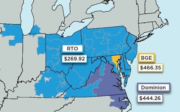
This area doesn’t just show up in daily LMPs, PJM’s release of the 2025/2026 Base Residual Auction (BRA) results had elevated prices RTO-wide, but also big jumps beyond that for both Dominion and Baltimore Gas and Electric. These results affirm the ongoing load growth and resource mix evolution in these areas that contribute to the operational issues discussed above.
Conclusion
When we founded Grid Status, we set out to build a successful business on top of the best way for anyone to monitor the grid. Our Nodal Price Map is a key step forward in that vision. With these examples in effective use, we hope to spark interest and creativity while demystifying core concepts in power markets.
If you have any feedback or want a demo of the complete Grid Status product suite feel free to reach out to us at contact@gridstatus.io.
Appendix
Use of Loss Component By ISO
| ISO | Used in Dispatch | Base Point (DAM) | Base Point (RTM) | Update Frequency |
|---|---|---|---|---|
| CAISO | Yes | SCUC AC power flow with generation and demand bids or load forecast | SCUC AC power flow with initial data from state estimator | Every hour in DAM and every fifteen minutes in RTM |
| ERCOT | No | Interpolation during settlement process | Interpolation during settlement process | N/A |
| ISO-NE | Yes | State estimator solution with estimated future operating conditions | Current state estimator solution | Every hour in DAM and every five minutes in RTM |
| MISO | Yes | Recent state estimator solutions with similar demand and wind characteristics | Current state estimator solution | Monitored in real time, with updates possible up to every minute |
| NYISO | Yes | SCUC AC power flow using a 30-day moving average of on and off peak power flows | SCUC AC power flow | During intermediate dispatch runs between DAM clearing and RTM clearing |
| PJM | Yes | State estimator solution with estimated future operating conditions | Current state estimator solution | Every hour in DAM and every five minutes in RTM |
| SPP | Yes | AC power flow after RUC with estimated future operating conditions | Current state estimator solution | Every hour in DAM and every five minutes in RTM |