Investigating Apple's Clean Grid Forecast
Apple recently released their Grid Forecast that predicts specific times as “More Clean”. Without much public information available, we decided to investigate.

Earlier this year, we noticed something new on our phones: a Grid Forecast from Apple, promoting when electricity from the grid will be “More Clean” with respect to emissions.
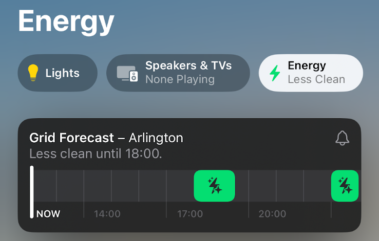
Being energy nerds, this stoked immediate interest: What metric is being used? What is Apple’s methodology? Is it any good? Quickly plotting the data against grid emissions reporting looked like this
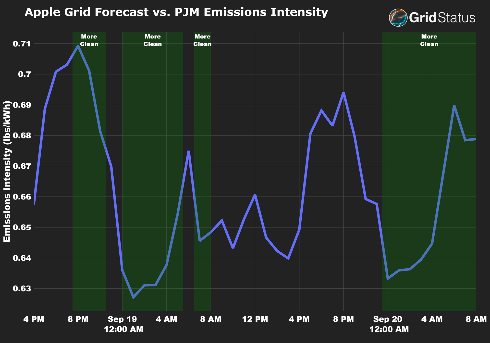
The forecast looks decent, low blue line, big green bar, but a closer inspection raises several questions:
- Why does the clean period begin while emissions intensity remains high?
- What causes the clean period to pause on the way down to shortly resume again?
- On the morning of the 20th, why is it considered clean while emissions intensity is on the rise?
But, we were also impressed by the forecast flipping for a brief period the morning of the 19th.
This was enough to pique our interest, and after a few months of data collection (more on that below), we’ve finally finished this post comparing Apple’s Clean Grid Forecast to data available on Grid Status.
Why is Apple Interested in Grid Emissions?
In September, alongside its usual product launch, Apple emphasized its ongoing commitment to carbon neutrality. This was conveyed throughout the event, from the typical focus on recycled materials to the divisive Mother Nature skit.

Under the surface, there were software changes as well, an evolution of Apple’s completely opaque “clean charging” (first launched the previous October) into a full on “Grid Forecast”.
Grid demand is met by a diverse mix of resources, which causes the rate of CO2 emissions to fluctuate throughout the day. By shifting flexible demand to different parts of the day, it's possible to reduce emissions with minimal effect on end users. This approach aids Apple in achieving carbon neutrality, not only for themselves but also for their customers.
This isn’t a new idea, so why does it matter that Apple has put their own Grid Forecast out into the world? As the largest consumer electronics company in the world — with ambitions to control your home and build your car — they have the potential to drastically change consumer behavior on a massive scale.
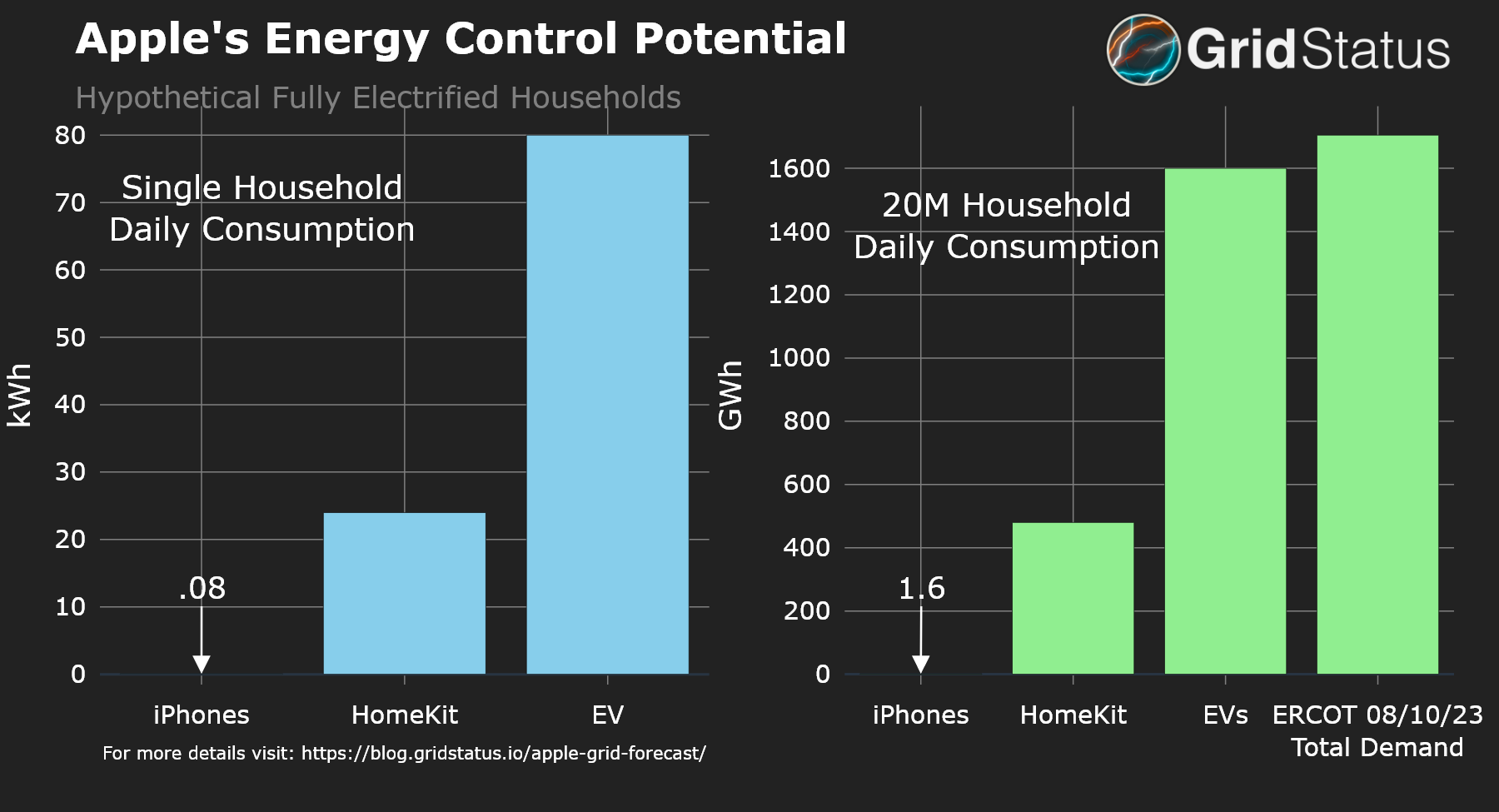
Above, we conceptualize Apple’s energy control potential with back-of-the-envelope math. The left panel depicts a single Apple-centric electrified home, while the right scales it up to 20 million households. Together, these handily exceed the total demand in Texas (ERCOT) on August 10th, the highest load day in our records. For more context and details on assumptions, expand the box below.
Apple's Energy Control Potential Assumptions
For reference, last year there were around 125M iPhone users in the US. Most iPhones can utilize a 20W charger. If they were to charge simultaneously for an hour we end up with (125M x 20W)/1000/1000 = 2500 MWh, not a number to sneeze at, but also unrealistic for many reasons, we’ll call this a very generous ceiling on iPhone energy demand. This is less than a single hour of full output at Robert Moses Niagara Power Plant. Our single household example is a 4 iPhone household, imagine some subbing in of iPads with similar specifications for additional flexibility.
With Apple’s clear whole-home ambitions and persistent EV rumors we extrapolate further. On the EV side, a single Level 2 charger at 10kW is worth 500 maxed out iPhones, but will be charging for longer, perhaps 4 hours, the value used in our example above, with two vehicles per household. The EV charging is also considered additive to the current home energy use statistics below.
Per capita annual residential electricity use in the US varies widely, but averages around 4500 kWh, or about 514 Watts per average hour. Apple HomeKit can manage a substantial chunk of household demand between thermostat controls as well as smart lighting and plugs. Assuming an electrified household, this could approach 50%, or a bit more than 250 Watts every hour, peaking much higher as a % during particularly hot and cold periods. In fact, since those times are most likely to be pushing the grid to its limits, emissions-based grid forecasting is even more likely to signal a low usage period as dirtier peaking plants have to come online to meet demand. We took this 50% flexibility across an entire day.
Anchoring this level of Apple integration is probably a HomePod, of which more than 40M have been sold over the past 5 years.
What Apple Says About Their Grid Forecast
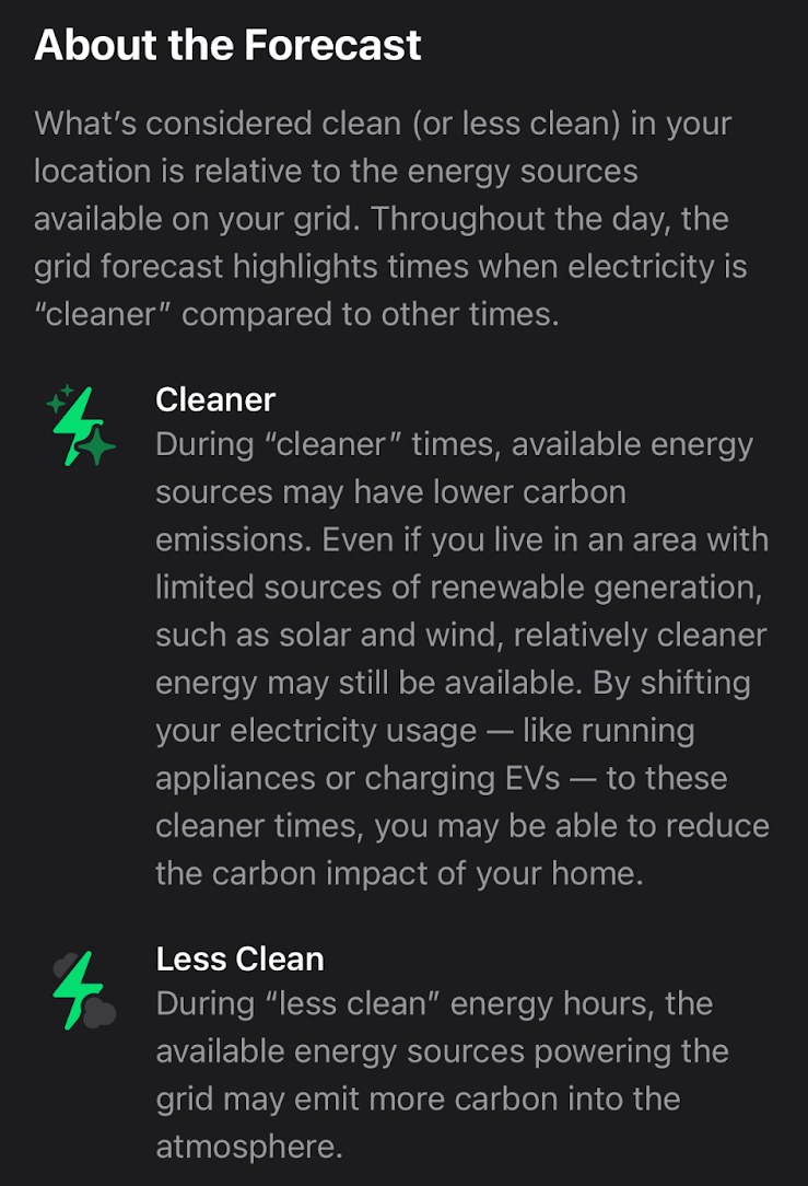
What you see above is nearly the entirety of the information Apple is making available on these forecasts, but we can glean a few things:
- It’s a forecast - this is important because a forecast is going to have some imperfections; and possibly change over time;
- It’s location-based, perhaps down to individual towns or counties;
- The forecast goes 12 hours out and seems to be in half-hour increments.
On the iPhone support page we learn one more piece of information, that the grid forecast is available in the contiguous U.S. only.
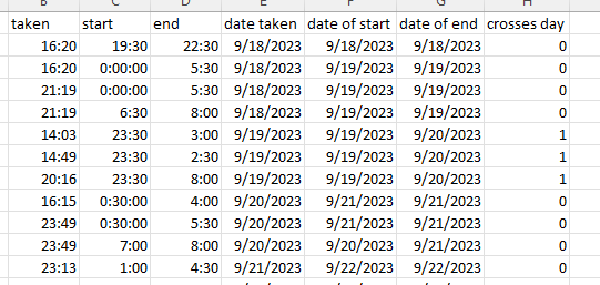
How We Collected Our Data
While we endeavor to understand Apple’s forecast as much as possible, we don’t have a way to cleanly extract data, so the “data” is nearly 80 screenshots, each covering 12 hours, taken from mid-September to mid-November and then transcribed.
Caveats
This manual approach has a few limitations
- Incomplete data coverage (we’re not robots, and iPhone automation vs shortcuts unfortunately doesn’t let you take a screenshot);
- An inability to fulsomely assess the way a single hour’s forecast changes over time;
- Being limited to the physical location of the individual taking the screenshots.
The data collection detailed above all occurred in the PJM market. PJM is the largest electricity market in the United States by demand, covering most of the Mid-Atlantic and stretching all the way to Chicago. Therefore, we will use data sources from the region, primarily PJM itself and the reporting it provides to the Energy Information Administration (EIA).
Given these limitations, our goal is not to provide a definitive statement on Apple's Grid Forecast, but rather to present our findings and encourage further discussion. With this in mind, let's analyze Apple's forecast using the data we have.
Comparing Apple’s Grid Forecast to Emissions Reporting
Let’s return to the style of graph at the beginning of the post, but for a day in October. We chose this day for its mix of more and less clean periods
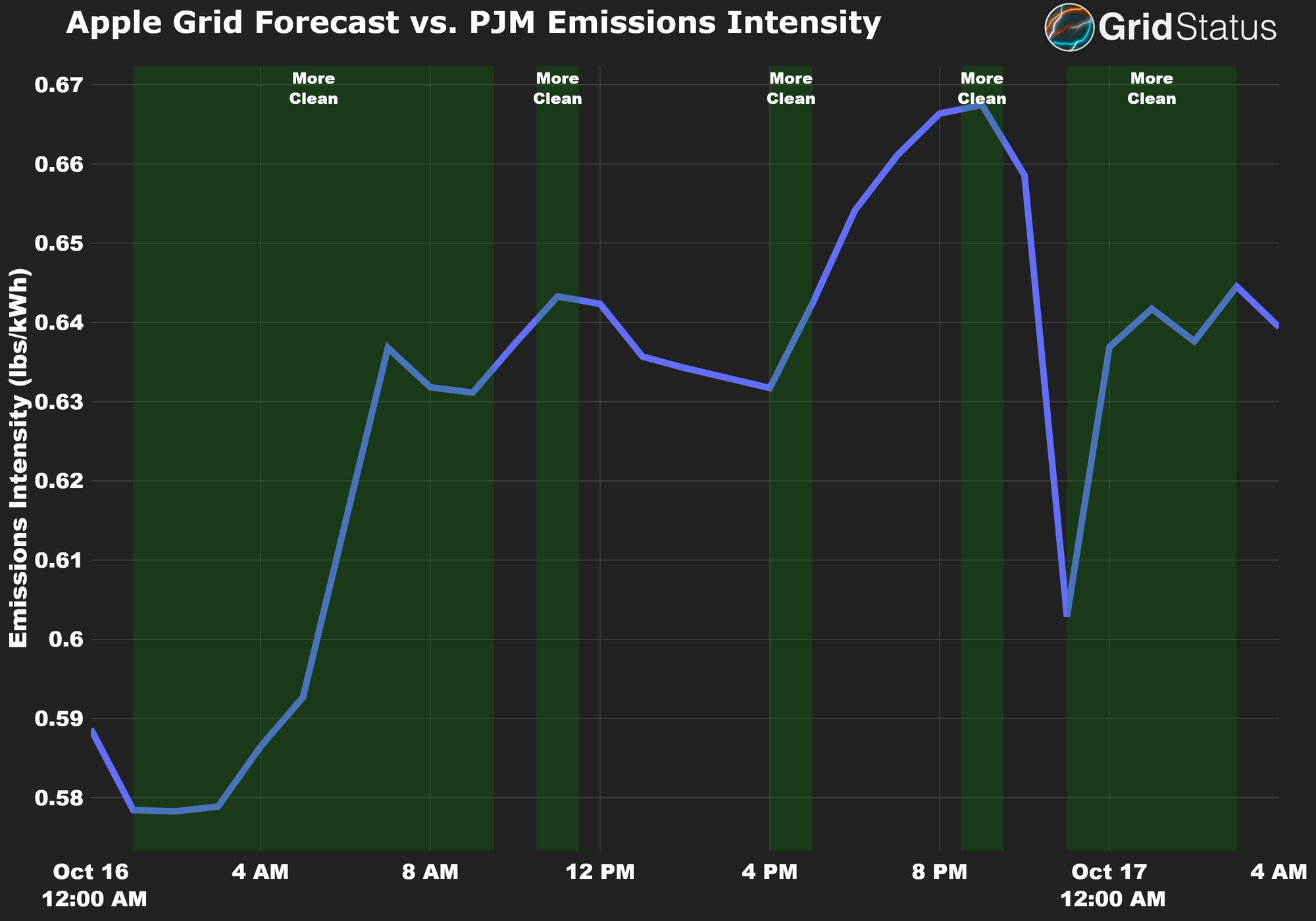
What can we take away from this chart?
Apple's forecast typically shows more clean periods overnight and early morning, times of low demand. During these hours, high-emitting peaking resources are offline, allowing resources like hydropower and nuclear to cover more of the total load. The forecast accurately identifies these periods as "More Clean," which makes sense as diurnal cycling is probably the single most predictable grid pattern.
However, the mid-day and evening “More Clean” periods are a bit more suspect. The forecast classified a late morning emissions peak as clean and misses the early afternoon emissions slump, only catching it as emissions go back up. Curiously, it forecast the peak emissions intensity over the entire period as “More Clean”.
We can also look at the same time frame through the types of generation on the grid. What do these “More Clean” periods look like relative to the rise and fall of actual generation?
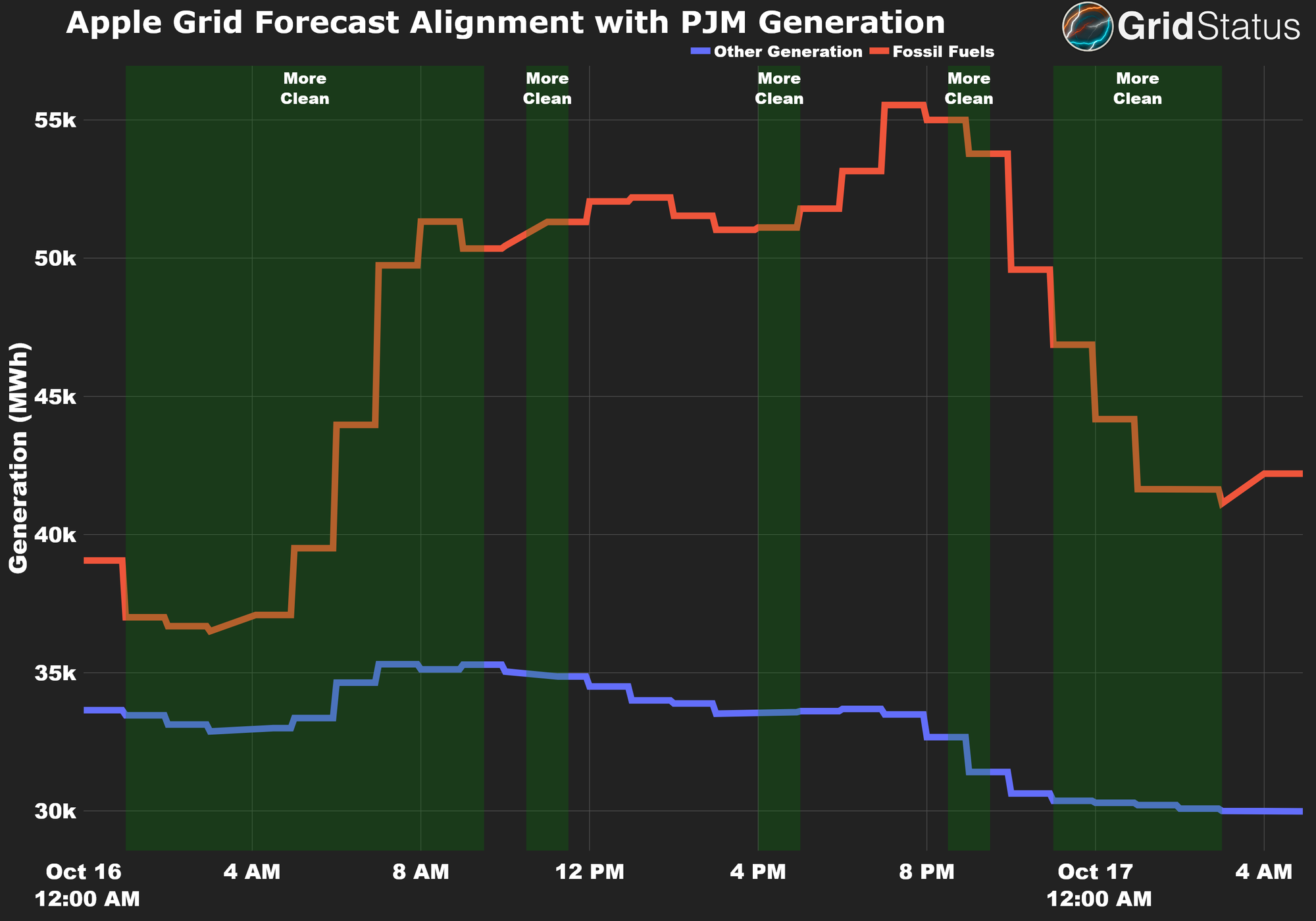
Viewed in terms of the generation mix, the mid-day "More Clean" periods are less convincing. The 9PM segment coincides with decreasing renewable generation and one of the day's highest fossil generation peaks and the rationale behind the late morning and mid-afternoon forecasts remains unclear.
Predicting that the grid tends to be cleaner overnight is not particularly impressive, and even less so when you consider that overnight charging is already the dominant paradigm for Apple devices with access to this data.
Now, let’s zoom out to the entire documented period.
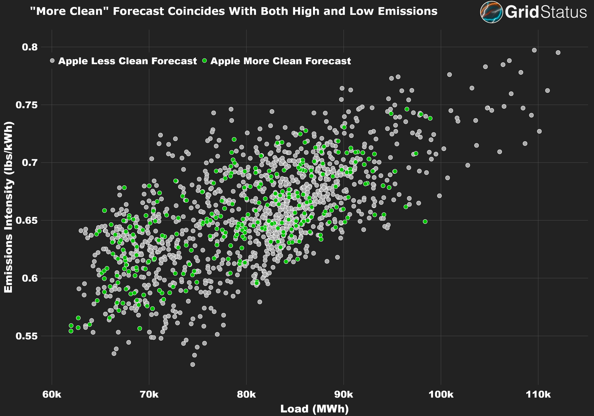
In this graph, we plot total PJM demand against the emissions intensity of consumed electricity. In an ideal load-shifting forecast, the green points should form a smooth diagonal, with gray points above, indicating optimal load-shifting periods for given demand level. However, the graph shows a jumble without clear trends. To Apple’s credit, their forecast does manage to avoid the highest emissions intensity for nearly all given demand levels.
Finally, let’s try one more way of slicing the data. More/Less Clean could be relative to whether or not the emissions on the grid are trending up or downwards. In the figure below, we plot the same timeframe as the previous chart, but using Change in Emissions Intensity vs the Change in Total Emissions. In each quadrant, we provide a possible explanation for the trend it represents.
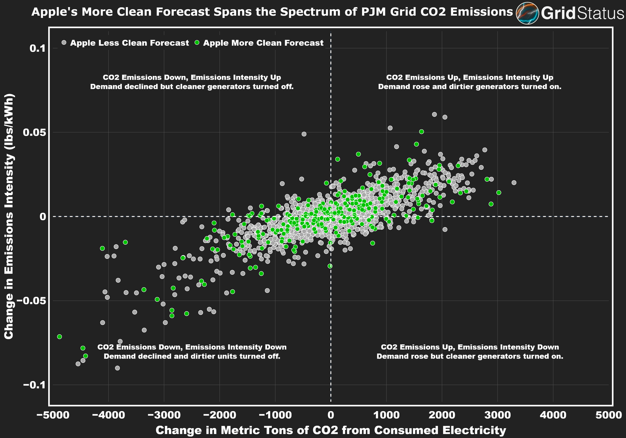
Keeping in mind aforementioned data access limitations, what we see is a distribution of “More Clean” intervals that looks no different than “Less Clean” in each quadrant of the chart. This suggests a weak correlation between clean charging periods and their emissions impact relative to the preceding interval.
From these results, we did not find evidence that the “More Clean” forecast can reliably be used to abate CO2 emissions via shifting load.
Perhaps discrepancies above can be explained by the geographic disparity in what is being graphed here - PJM-wide emissions vs. Apple’s (supposedly) more granular forecast. Unfortunately, without concrete information from Apple on their methodology this distinction is not easily ascertained.
Another Theory for What’s Going On
Another possible explanation is Apple is using a different approach for defining what it means for the grid to be “More Clean”.
Assuming Apple didn’t build this entirely in house, a potential partner is WattTime. WattTime is the longest-lived public service for grid emissions forecasting in the U.S. and doesn’t provide coverage for Alaska or Hawaii just like Apple's offering. Also, it may just be speculation, but folks on Twitter seem to think WattTime is involved.
WattTime provides two signals
- Average operating Emissions Rate (AOER). Which is “a calculation of the average emissions rate of all the electricity generated on the local grid at a certain time”. This is most similar to the Emission Intensity metric used in the graphs above.
- Marginal Operating Emissions Rate, which is “the emissions rate of the electricity generator(s) that are responding to changes in load on the local grid at a certain time”,
WattTime says that average emissions are “a way to allocate responsibility for emissions evenly”. Conversely, they argue that marginal emissions assign responsibility "causally", which can be used to make decisions that avoid the most emissions.
Marginal Emissions
The marginal emissions concept is simple, albeit quite difficult in practice. Some examples of what might happen in response to decline in load:
- Hydropower is turned down - the marginal emissions rate is 0 short tons of CO2
- A 7 heat-rate combined cycle unit ramps down - the rate is 0.413 short tons
- A 12 heat-rate oil peaker turns on during a New England winter, 0.96 short tons
- Price declines, a battery starts charging, and it, well, it’s complicated. . .
The conceptual math isn’t challenging (unless you’re a battery), but in reality it’s a lot more complicated. With congestion between locations on the grid, the next “economic” unit may not be based on their operating costs, but the difficulty in flowing power from one location to another. So you can’t necessarily save half a ton of CO2 emissions by getting enough iPhones in Long Island to shift their load from oil-peaking to gas-peaking times because Long Island can’t get enough gas-powered generation from the rest of the state in the first place.
PJM’s Warning
It’s important to emphasize how quickly complexities mount with marginal emissions. In their primer, they warn (emphasis added):
While people often think of the generation supply as large groups of resources defined by their fuel type – nuclear, wind, gas, coal, solar, etc. – the reality is that many of these resource types are interwoven with each other. As a result of this, and the constant re-dispatching of the system to meet real-time demands, marginal unit changes cannot be reliably predicted.
PJM urges folks to not even use their own nodal marginal emissions estimates (emphasis added):
“PJM provides this information to help inform stakeholders and policy makers as to the real-time conditions of the system. Because of the various constraints and complexities involved, PJM cannot and does not make any guarantees as to the accuracy of the information nor that it is fit for any purpose. PJM does not support the use of this information by any party to demonstrate compliance with regulatory mandates in any jurisdiction.”
This statement from the grid operator essentially means, “we were asked for this so many times we’re doing it, but no one should trust the information herein to be accurate”. It’s a fair warning, if you pull in a node’s data, the values can swing wildly enough as to make a chart incomprehensible
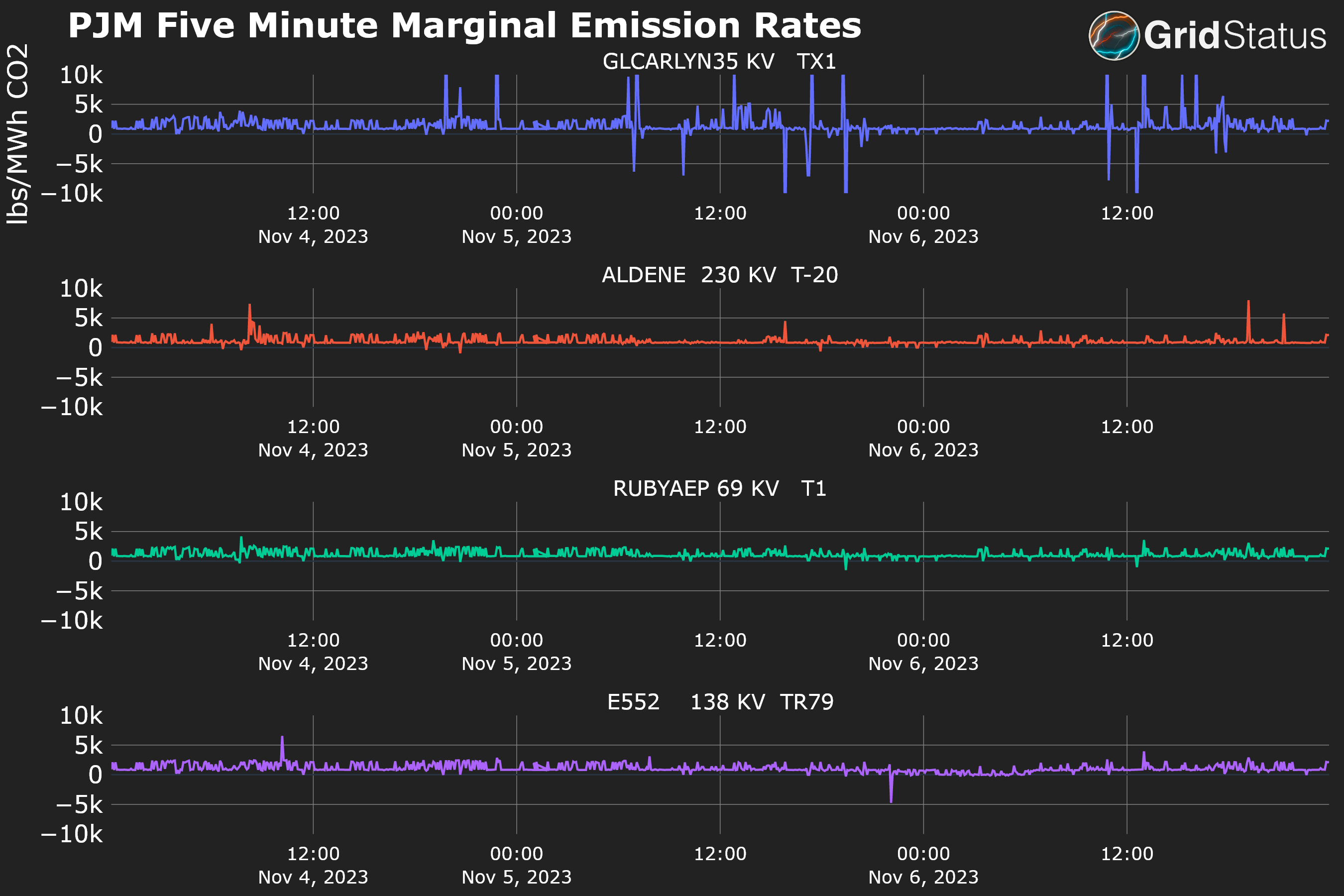
Here we’re limiting the values between -10k and 10k because plotting the full extent of the data renders it illegible (values exceed 29M on the high end and -5M on the low end). At this level, the noisiness and near constant swings are readily apparent.
Should you trust Apple’s Grid Forecast?
Now we return to the question of transparency in Apple’s methodology. Apple is the largest company in the world by market cap and famously known for striving towards atomic perfection while also being notoriously tight-lipped.
Regardless of the specific approach adopted by Apple, the burden of proof for showing that load shifting reduces emissions falls on them. While we don’t want to be too hard on forecasts (which are particularly difficult to get right in general), Apple is a multi-trillion dollar company with a massive, talented workforce and pushed this feature to millions of devices - high expectations don’t feel unreasonable.
Heck, we want to stimulate interest and provide new ways of looking at things ourselves, but without more info it’s hard to find evidence that what Apple’s doing here is little more than a novelty. Something for them to point to as “doing their part”, while providing no actionable information to verify or additional materials for their customers to learn from.
In its current state, Apple’s Grid Forecast feels more like a crossed off checkbox than a fully fleshed-out product.
Given the persistent rumors of an Apple EV and their clear whole-home ambitions, this grid forecast could rapidly expand its reach beyond the relatively small load shifting possible via phones. With that in mind, it’s even more important for Apple to open its books and explain their sources, process, and tradeoffs required to get this iteration of grid forecast out the door.
The World Beyond
Despite recent regulatory wins for clean technologies enabling more funding than ever before, emissions accounting itself is in a precarious place. Voluntary offsets are plagued by scandals and low prices for offsets, but high prices for verification. Public corporate ESG pullback has continued. NYISO’s carbon price integration floundered then got put on ice. RGGI expansion has been wobbly.
Given the caveats coming from a major grid operator describing post-hoc data it’s no surprise that Apple’s forecast may be a bit iffy, but there is a light at the end of the tunnel. Building off of fixing existing frameworks or through entirely new paradigms, a number of startups and new ventures within established entities are trying to rectify past mistakes or evolve the model in new directions:
- Tierra Climate is doing grid modeling to place a carbon value on load shifting via utility scale batteries;
- WattCarbon has developed its own open source Energy Attribute Certificate registry to track the CO2 equivalents down to the gram per watt-hour;
- ReSurety is integrating locational marginal emissions data via WattTime, and making it publicly available, albeit in a very limited fashion;
- Climate TRACE just announced a massive expansion of their coverage;
- NCX is building a marketplace reliant on utilizing remote sensing to develop more accurate valuation and tracking of natural carbon;
- And many more.
Conclusion
Forecasting the emissions of the electrical grid in a specific location is a complex and challenging endeavor with potentially massive impact.
As we close, it’s worth making clear that more interest in the grid and innovation around forecasting is a good thing. However, if we want to move towards a cleaner energy future with opportunities for folks to mitigate their own impact through flexibility, the currently opaque “Grid Forecast” system may turn out to be insufficient.
We are nearing the launch of exciting new dashboarding and alerting features on Grid Status. To join the beta and get early access, sign up for our waitlist here. We take feedback into account when prioritizing our roadmap, so please feel free to reach out on Twitter, LinkedIn, or through email.