One Week of Data from Market Renewal in IESO
From nodal spreads to capture rates, we’re taking a look at the first week of action and outcomes in Ontario’s new nodal market.


Last week marked an important milestone for the Independent Electricity System Operator (IESO) of Ontario: the successful launch of its Market Renewal Program (MRP). These reforms (detailed in our blog here) are expected to generate $700 million in cost savings.
From nodal spreads to capture rates, we’re taking a look at the first week of action in Ontario’s nodal market.
Despite some last-minute stakeholder skepticism and initial submission hiccups, the MRP launch went smoothly for an endeavor of its magnitude. On the morning of April 30th, IESO notified market participants that MRP was a go and began retiring legacy programs. Early on May 1st, system operators began manual price administration, and the first real-time LMPs were published by 4 AM.
For May 1st and 2nd, IESO declared a planned DAM model run failure and dispatched units in real time. The first official run of the new DAM took place on the morning of May 2nd, and was successful, with results posted early that afternoon. As the launch has progressed, additional data streams have entered publication, such as constraint shadow prices. One major component of the MRP that has yet to go live is virtual trading. Market participants will be allowed to submit prudential support on the morning of May 8th. Once this process has begun, IESO plans to announce the completion of the MRP.
Surprising Range in New Zones
Early outcomes suggest that IESO is not a complete walk in the park when it comes to moment-to-moment pricing. In fact, both the congestion and loss components have had something to say in the early days.
First, a caveat. Because the market is only a week old, values and rankings are unsettled and likely to change dramatically. Some of these trends may become durable strategies over time, but for now they’re in early infancy — nearly blind, and like a newborn’s hair, more likely to fall away than stick around.
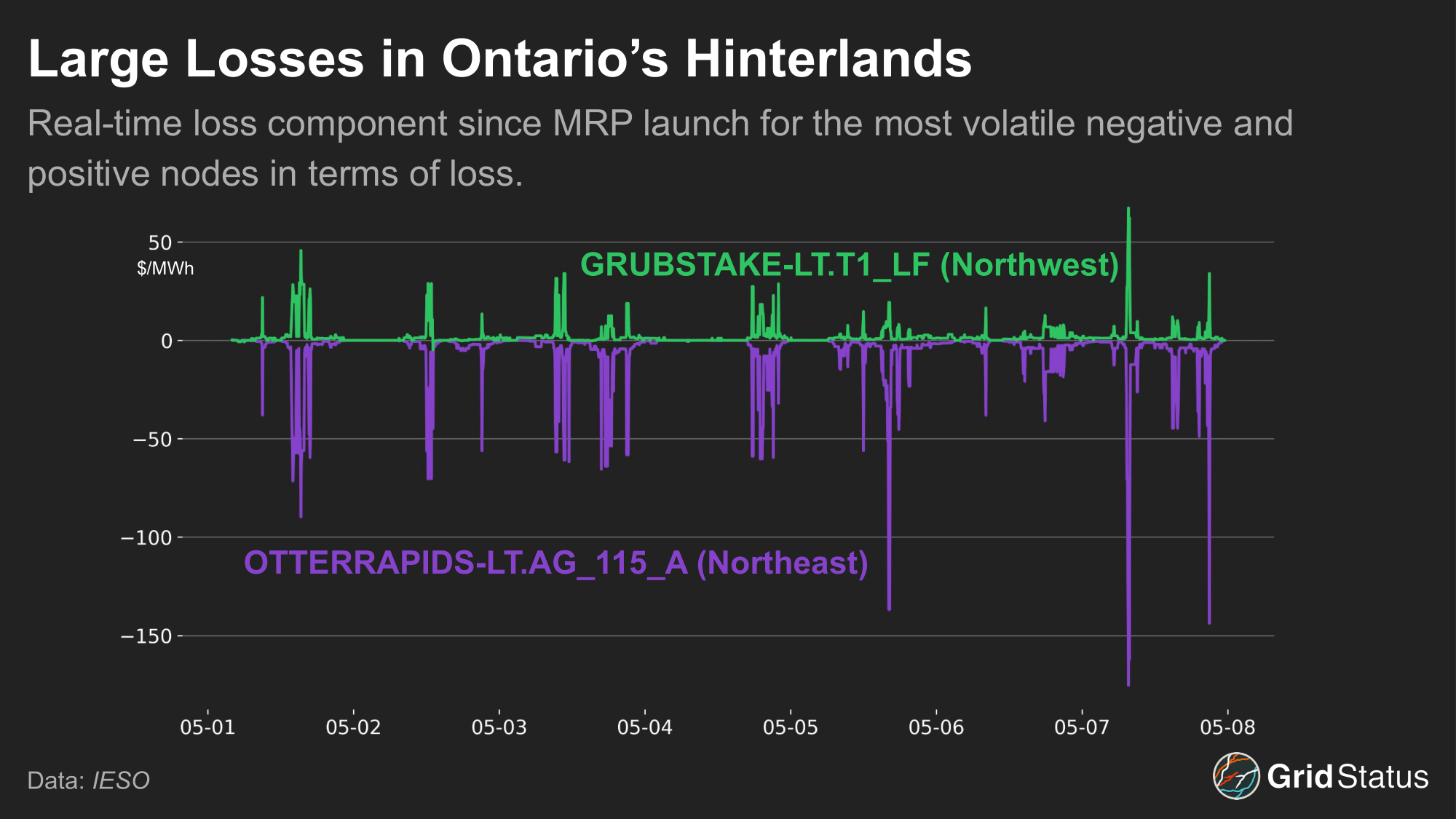
Let’s start with loss, which has shown quite a range relative to most other markets (CAISO excepted). IESO’s reference bus is the Richview Transformer Station in Toronto. With the geographic size of the province, certain locations are a substantial distance away, whether measured by crow or electron, which is reflected in the loss component.
Wide congestion spreads have also emerged in the real-time market since MRP went live last week. Two of the most volatile nodes so far have been LONGWOODESN-LT.LFJQ and CARIBOUFALLS-LT.AG123 — let’s take a look at each of these nodes.
So far, Longwoodesn has seen the highest level of real-time congestion upside, averaging $5.78 MCCs. Longwoodesn is a load node located in IESO’s West virtual zone, which has had bouts of peaky volatility. Caribou Falls is a 91 MW hydroelectric dam located in the Northwest zone and has seen consistent downside since MRP went live, averaging -$13.43 MCCs. Notably, these nodes have extreme geographical separation, with Caribou Falls located near Manitoba and Longwoodsen close to Detroit, the same 800-mile distance from Washington DC to Mar-a-Lago.
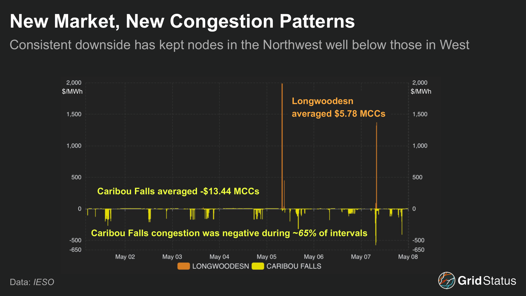
Plotting both nodes’ congestion costs reveals another stark difference between the two. The vast majority of Longwoodesn’s upside came from just a handful of intervals on the mornings of May 5th and 7th. Remove these, and the node falls out of any rankings you might conjure. Conversely, the downside congestion at Caribou Falls is consistent. This relationship is a microcosm of trading in these markets, managing consistent low-level arbitrage while being prepared for big swings. The negative congestion at Caribou Falls has kept it consistently below other nodes in IESO, a trend seen for many nodes in the faraway Northwest.
Your Trade Might Have Broke Up or it Might Have Capsized
While virtual trading is not yet live (and will only exist at the zonal level), it’s still worth taking a look at the nodes and zones together as a reference.
What is a Zone?
A quick aside on the use of “zone”. Ontario did not implement zonal load pricing, but zones still exist in the context of virtuals, and each individual node has been assigned to a particular zone. Terminology has been a bit mixed, with presentations referring to “Virtual Transaction Zones” and “Virtual Zones”, while some reports simply refer to the “Zonal Price”, and the price report itself appends :HUB to each zone, e.g., EAST:HUB. In this case, the distinction between zone and hub is perhaps one without a difference, but the confusion over terms is real.
So far, the wide open spaces of northwestern Ontario have seen the biggest spread in prices across local nodes. In fact, the Northwest and Northeast (which itself is northwest of where most people live in the province) together account for the majority of both positive and negative basis.

Northeast and Northwest aren’t hinterlands with a surfeit of nodes either, as the Northeast zone has more than 180, while Northwest crosses the 100 mark, together comprising nearly 30% of the total node count in Ontario.
We can also look at basis on the level of individual nodes, ordering the result from most to least, the volatile nature of the constituent nodes is immediately clear.
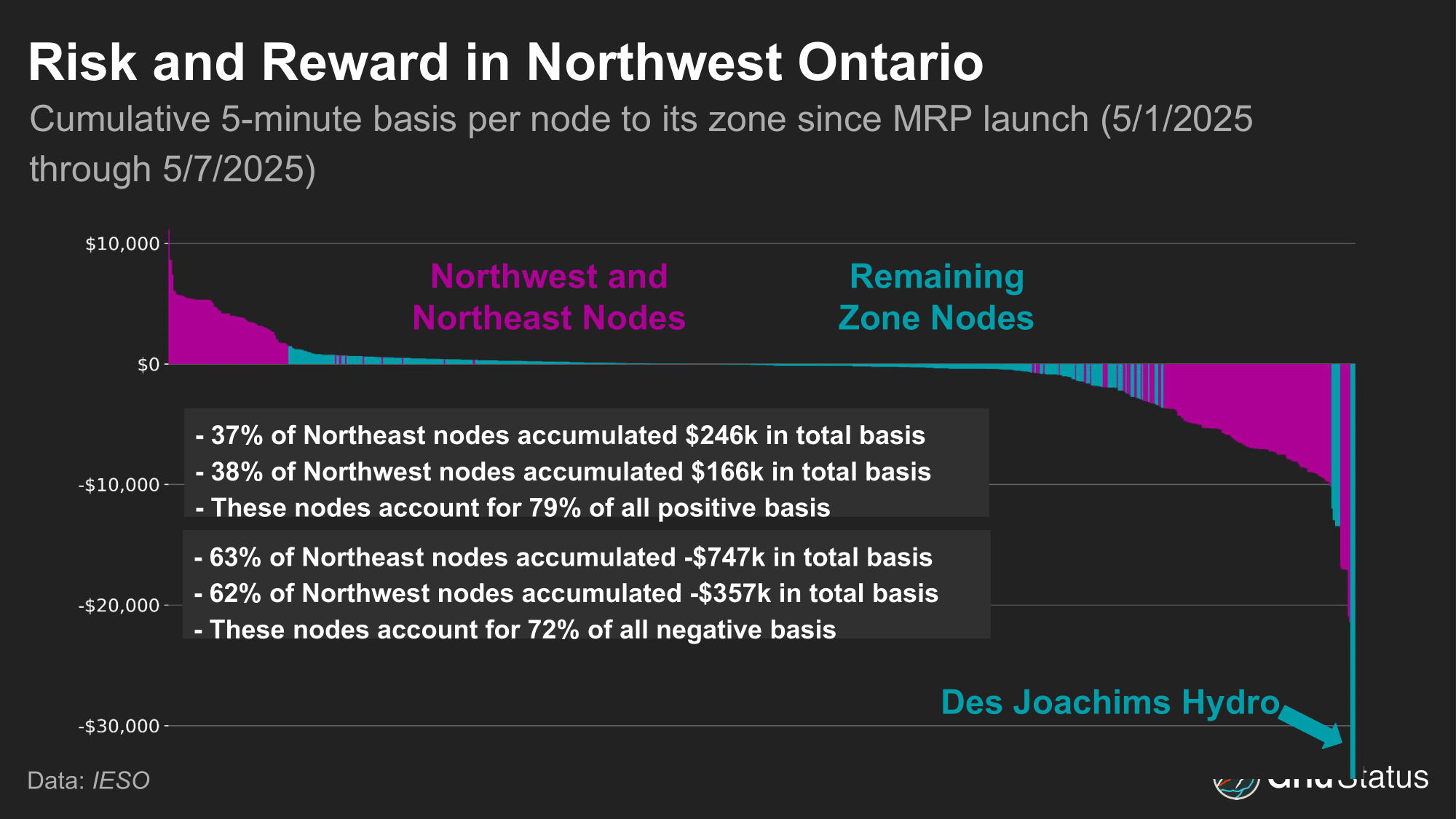
63% of nodes have accumulated less than $1000 of basis compared to their zone during the first week of operations, averaging under fifty cents per interval. This is closer to what many observers assumed about Ontario’s market, which has lower demand than most of its neighbors and is backed by a relatively large resource base. But all those years of a unitary HOEP may have lured some into a false sense of security.
However, even in this first week we’ve already seen some dramatic outliers, such as Des Joachims hydro, whose price was completely divorced from the surrounding area from the morning of the 7th until early evening on the 8th, sitting at the negative price cap of -$100 for 36 hours.
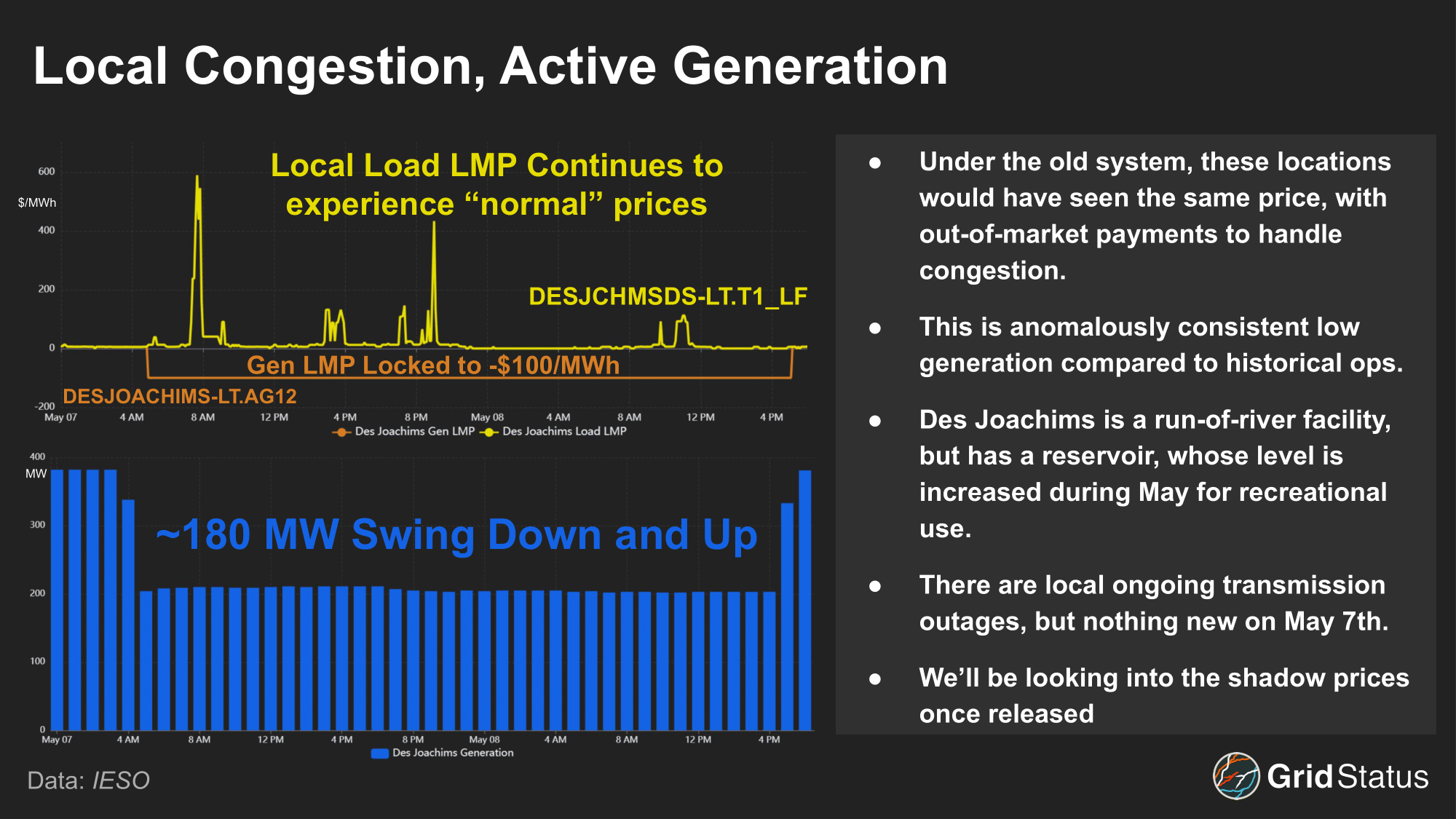
While IESO has not released shadow pricing for these days, the extreme downside at Des Joachim appears to be driven by E-MISC.DESJOACHIMSGENERATION, a local base case constraint that first appeared in and vanished from the Dispatch Security Constraint report when the congestion emerged in real-time. While the LMP sat at -$100/MWh, the price floor, congestion costs adjusted with each print, going as far as -$720/MWh, to send the clearest price signal to Des Joachim to reduce output.
Won’t You Be My Neighbor?
Post-MRP, external interface LMPs have a new cost component, the Net Interchange Scheduling Limit (NISL) Price. The NISL limits the hour-over-hour change in net tie flows across all interties to protect the integrity of Ontario’s system and generators. This limit is typically set at 700 MW but can be changed depending on market needs. Both the day-ahead and pre-dispatch model runs reduce imports and exports that would have been economic due to the NISL. The NISL cost is calculated based on the savings if the NISL were decreased by a MW, similar to shadow pricing.
External congestion costs are also factored into intertie pricing. An external intertie binds when the number of economic export bids is higher than the intertie limit. To determine the external congestion costs, IESO relaxes the transfer limit and subtracts the bid of the additional MW that would be economic from the intertie border price. The combined NISL cost and External Congestion Component make up the Intertie Congestion Price, which is then added to the Intertie Border Price and establishes the Intertie LMP.
During the first week of the renewed market, external congestion costs have been seen at 10 of 18 external interfaces. The MN.INTFALLS_MNSI interface with Minnesota has been the most congested, with an average shadow price of ~$11/MWh.
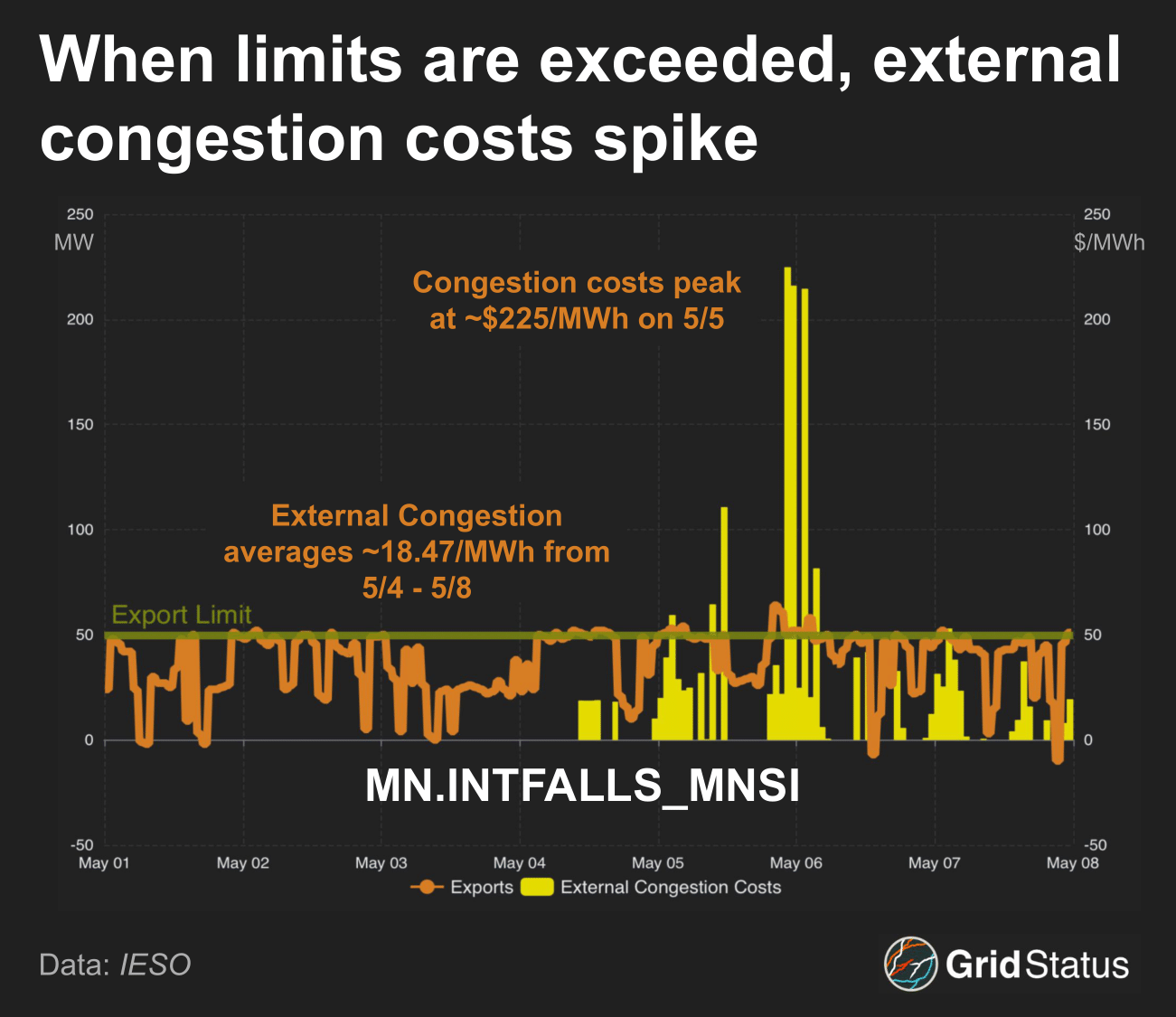
In the first four days of MRP, there were no congestion costs associated with the interface. The lack of congestion looks to be driven by the lack of volume on the interface itself, as average flows came in at ~31 MW, well below the 50 MW export limit. Export congestion appeared on May 4th as volume ramped up, averaging ~41 MW. MN.INTFALLS_MNSI is an outlier among interfaces, seeing external congestion ~28% of the time, well above the average of 5% for all others. Additionally, this interface binds stronger than others. Average external congestion, excluding MN.INTFALLS_MNSI, is $2.95/MWh, ~26% of MN.INTFALLS_MNSI’s external congestion costs.
What Can a Price Signal Do For You?
For gas generators, the MRP, like their fuel, may have been just-in-time.
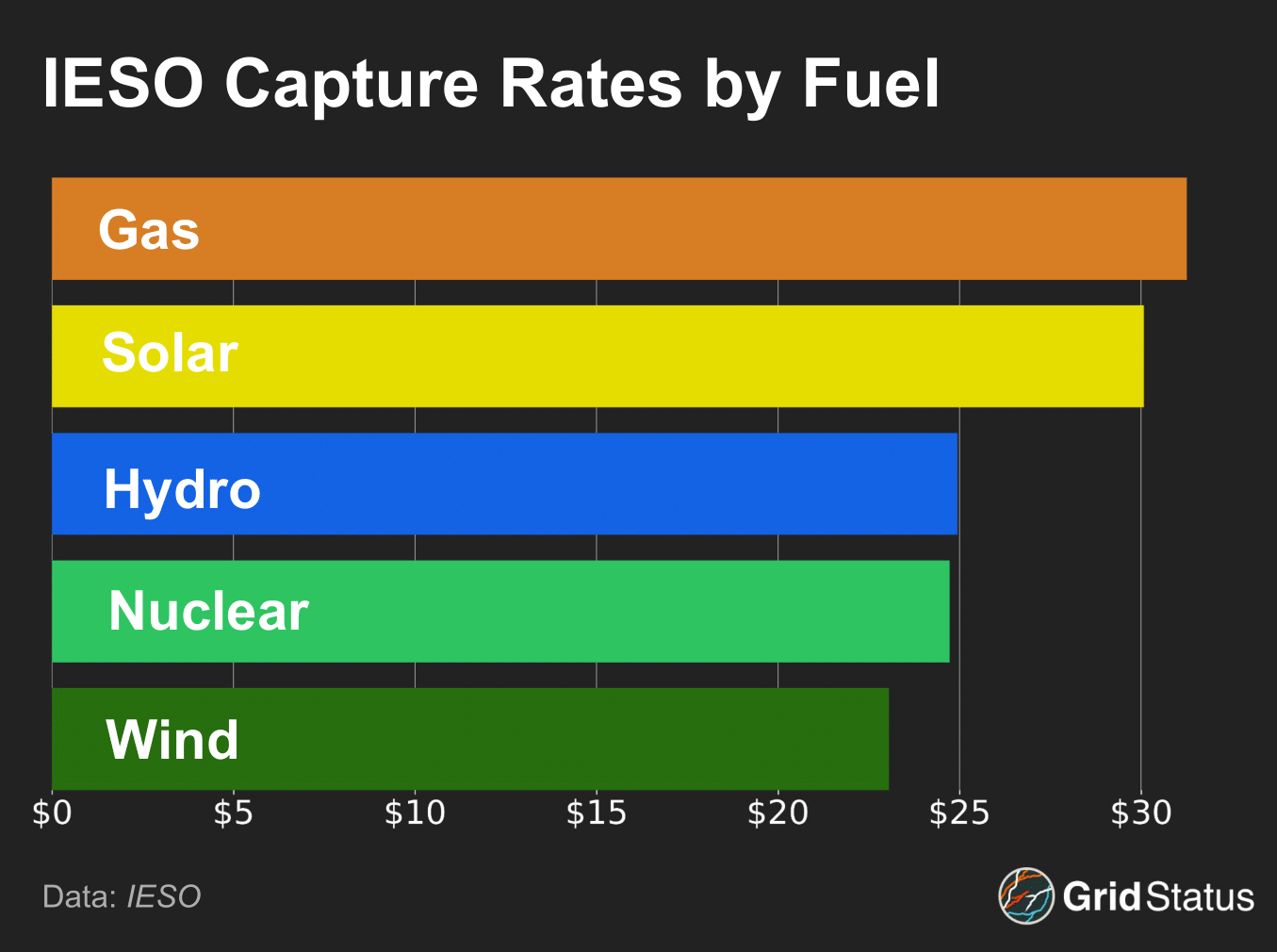
Over the next ten years, more than 5 GW of gas capacity in Ontario will roll off of capacity contracts with IESO. With nodal pricing and real-time congestion, flexible units have greater revenue opportunities than under systemwide pricing. However, while capture rates may bode well for gas units so far, it’s not clear that their potential flexibility plays much of a role in capturing that value compared to IESO’s diurnal price cycles and two West zone morning price spikes that a handful of gas units benefited from. In recent years, gas in Ontario has flexed up when nuclear outages rise and wind is low, while hydro is the resource that provides more regular grid flexibility under all conditions.
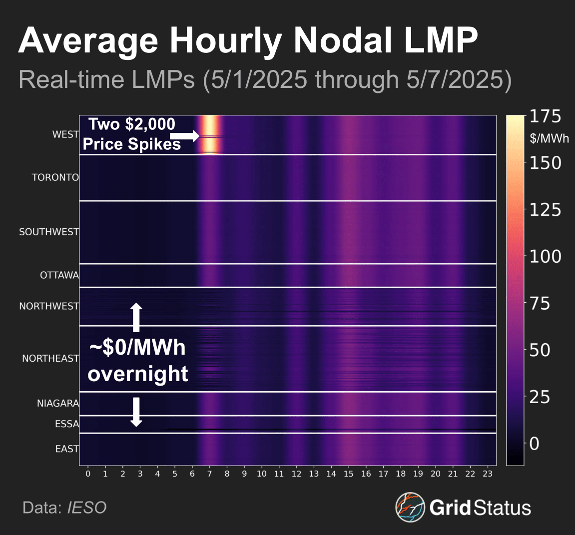
While some price spikes in the West zone stand out, the early morning may be the most interesting part of this view. These intervals consistently have $0/MWh prices for hours at a time, driven by the region’s inflexible generation sources like nuclear, wind, and hydro, creating periods of considerable oversupply relative to Ontario load.
This is evident in IESO’s forecasted surplus baseload capacity, which is typically highest during the early morning. IESO typically resorts to exporting power during the morning, leading to wide differences between Ontario load and market load. While extremely weak energy prices have been the trend so far, this is the tail end of shoulder season, and it remains to be seen how prices respond during periods of higher demand and greater system stress.
Finally, Ontario’s population density has contributed to some price distortions, as the sparsely populated Northeast and Northwest have routinely seen high negative loss costs, whereas zones in the south of Ontario, close to major load centers like Toronto, have seen much more minimal loss costs, reducing the impact of that component on their price spreads.
Markets and Data as the Ship of Theseus
New IESO data has been flowing into our system since MRP began on May 1st. Our nodal price map began displaying hundreds of new nodes and we’ve added over two dozen additional datasets. But, along the way, some existing datasets were retired. The question of whether to replace in place or keep a no-longer-updating dataset in stasis while its cousins with a slightly different name lives on is never perfectly straightforward. Regardless of the decision we make, we personally reach out to every API user pulling data from a newly retired or changed dataset to make sure it doesn’t impact their workflows, and the good ship data continues sailing on with a few new planks.
We’ll continue building, updating, and blogging as more markets have their own restructuring events this year. From the continuous cycle of interconnection reform, to MISO’s autumn VOLL changes, to ERCOT’s year-end RTC+B blowout, we’ll be here. But if you ask us for a take on the Iberian grid, we’ll do something that no aspiring social media influencer could bring themselves to consider, be honest and say “we don’t know.”
Please reach out at contact@gridstatus.io if you want early access or have any suggestions on the types of research or content you'd like to see.